
College photography case study
July 6, 2022Late last year I was commissioned to photograph Hugh Baird college in Liverpool over 3 days. The brief aimed to cover as much ground as possible within the different areas refreshing images and giving them specific assets to use across various marketing channels as well as the all-important prospectus.

I worked closely with the design team making sure we got the right images, using their brief and our combined creativity. I always like to see the finished articles once they have been published, partly because it’s great to see them but also because it helps me understand how the design teams are likely to use my images in the future. Often it’s just a case of leaving more negative space in the frame for the overlaying of text or other elements. Sometimes it’s consciously taking a photograph knowing that it will be cropped in a certain way. Then again, the images may just be used in a collage as in this layout:

Creativity is a huge part of my photography. As someone with a background in the arts, I’m always trying to stretch myself and think of different ways of conveying what’s in front of me. It can be angles, lenses, light or various in-camera effects but to me it’s important to be able to give something a little different to the client. I go into more depth on this in the following article:
https://www.chrisfosterphotography.com/blog/using-creativity-within-a-brief
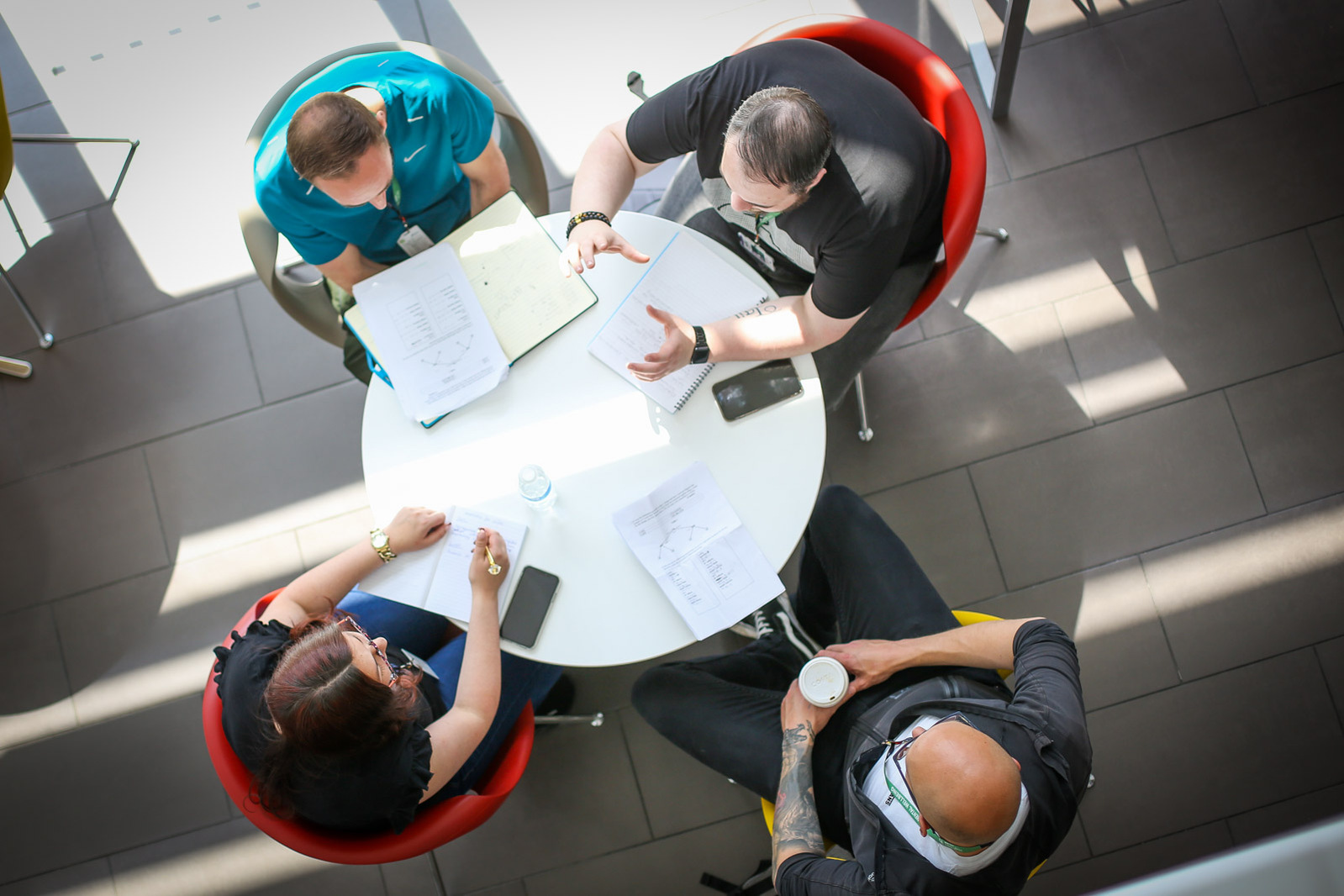
Here are a few examples of where a photographer’s eye can create something that pops and helps grab attention. Modern buildings will often have fantastic light and vantage points to look down on a subject.
Sometimes an image just works on its own and deserves to have some space from others as in this example here. That’s obviously a decision for the design team but from experience I know an image like this is likely to be treated in such a way so I will spend more time carefully lighting and editing to get the most impactful result.

Here the image is colourfully framed whilst bringing attention to the foreground.

In this case the image has more impact because of the background, framing and lens choice. I used a longer lens to compress the image framing with the tables, pillars and ceiling to bring focus into the students and the graphic background.

It’s always important to keep half an eye on the weather with something like this knowing that some outside shots are required. Building a bit of flexibility into the schedule helps here and living in the northwest of England certainly helps create an instinctive awareness of when the sun might come out!
